Digipak Research
Unfortunately I could not find any Dubstep digipaks, instead I have researched Dubstep CD covers and then looked at digipaks from other Genres.
Dubstep Albums:

Chase & Status - "No More Idols" Cover
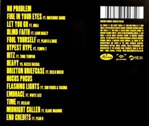
Chase & Status - "No More Idols" Back Cover
|
Chase & Status - "No More Idols"Front Cover
The Background: The Background for the back of this album is just simple image. It is a photograph of a dog, and the shot is a close-up on the dogs face. It is hard to say what the setting is, however it looks most likely to be outside somewhere, meaning they have used natural light to take this image. The image has been edited into a black & white/grey-scale colour to make sure that the writing stands out in front of this image. The Text: The text on the front of this album is the bands name, and beneath that the album title. The name of the band is in a rather large font size, and the actual font used is also the one seen on their website - this shows consistency throughout their products. The album title is noticeably smaller than the band name, this is greatly due to the fact that the audience is more likely to recognise the bands name than the album title. All the writing on the front cover has been written in the same font and colour. Back Cover The Background: For the back cover they have decided to keep the background basic, it is plain black. This has most likely been done to make the font stand out. Even though it is not an image, it still fits with the front cover due to the colour (grey-scale/black & white). The Text: The font colour and type of font has stayed the same as on the front cover. The main text on the back cover lists the songs titles within the album, these have been aligned on the left hand side of the cover. All of the song titles are the same size, and some of them have the accompanying artist name in a smaller font size next to them. On the right hand side their is a chunk of text underneath the bar-code which lists all of the legalities connected to this album including the copyright and registered symbols. Other: The bar-code is in the top, right-hand corner, and production company logos are underneath the section of text listing the legalities. These logos have also been put into the same colour as the font. |

Deadmau5 - "At Play" Cover
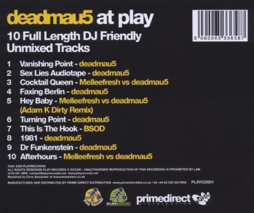
Deadmau5 - "At Play" Back Cover
|
Deadmau5 - "At Play"Front Cover
The Background: The background for this album front cover is plain black, with a large 3D image version of the artist's logo in yellow and white. This is quite simple, but effective. The Text: At the top of the page is the artist's name, in yellow, using usual font. Underneath this is the album title, which is the same font and size as the artist's name, however instead of yellow it is white. At the bottom of the page, there is some text telling the audience what the album contains: "10 Full Length DJ Friendly Unmixed Tracks". This has been done in a different font and size to the titles, but has been done in the same yellow colour as the artist's name. Back Cover The Background: The background for the album has been kept simple, as it is just plain black. This helps focus the eye on what is written on the back cover. The Text: At the top of the page, the artist's name, and the album title have been repeated. They are the same colours as on the front cover, but a more readable font has been used. Underneath this the text from the bottom of the front cover has been repeated, but this time in white. Then the song names are listed, with the song number, the song title, and the contributing artists. These have been done half yellow and half white, like the titles. Underneath the songs, the legal text is written, including copyright and registered symbols. Other: In the top right hand corner is the album's bar-code. At the bottom of the page the production company logos are displayed. |

Modestep - "Evolutionary Theory" Cover
|
Modestep - "Evolution Theory"Front Cover
The Background: The background for the front cover is a cartoon image of a robot. The robot's head even incorporates the artists logo. As the album title is 'evolution theory' this robot image has obviously been used to link to the same idea. The Text: The only writing on the front cover is the album title and the band name. The album title is in quite a large font, which is black. The artists name is written in the same font, but a slightly smaller size. It is placed above the album title, and the letters have been spaced out. Unfortunately I could not find the back cover for this album. |

Skrillex - "BANGARANG" Cover
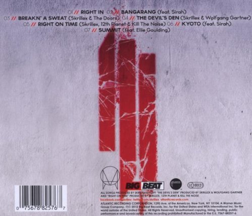
Skrillex - "BANGARANG" Back Cover
|
Skrillex - "BANGARANG"Front Cover
The Background: The image used for the background on this album looks like broken ice or glass, it looks quite futuristic. The colour of this background is grey-scale, but mostly pale grey or white. This allowed the text on the cover to stand out. The Text: The only writing on this page is the artist's name and the album title. The font type used for the artists name is the one used on all Skrillex products, and includes his logo. Underneath this, in a smaller font size, and somewhat similar font type, we have the album title. All of the writing is in red, making it stand out from the background. Other: In the bottom right-hand corner a 'parental advisory' logo has been added. Back Cover The Background: The background image looks like a white/pale grey wall, and has the artist's logo in the middle of it, in a similar red to the front cover(looks like graffiti). The Text: At the top of the page there is the list of song titles from the album. Each song is numbered, with a simplified version of the logo before it. Some of the song titles also have the accompanying artists name next to them. The song titles have been written with a bold (but small), black font. In the bottom right hand corner of the page, all of the legal text has been written. Including the copyright and registered symbols. Other: Over the legal text, there are logos for the production companies. In the bottom left-hand corner is the album bar-code. |
Other Genre Digipaks:

Pendulum - "Hold Your Colour" Digipak
|
Pendulum - "Hold Your Colour"As this artist is not part of the genre I am researching, I will only assess the layout ides (etc) of the Digipak, but not fonts or covers, etc.
Layout: This Digipak is split into three sections. Here, the middle panel holds the CD. Instead of a leaflet, they have incorporated some extra information onto the extra panel in the Digipak. |
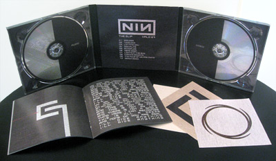
NIN - "The Slip" Digipak
|
NIN - "The Slip"As this artist is not part of the genre I am researching, I will only assess the layout ides (etc) of the Digipak, but not fonts or covers, etc.
Layout: The Digipak has been split into three sections. The two outer sections have CD holders on them, and the middle section has a space for the Digipak leaflet. Once folded together, the Digipak will not be much thicker than a normal album. |
