Question 1 - In what way does your media product use, develop or challenge forms and conventions of real media products? Used in Real Products
Website
Sample of backgrounds from the home-pages I researched
|
BackgroundEach of the sites used fairly plain backgrounds. The colours were usually dark and grey-scale. Some of the sites have patterned/picture backgrounds, but these are subtle, so that the eye is not drawn away from the information/images on the page itself. Some of the pages also have extra backgrounds for the bits of text on the page, to make sure it is readable.
|
LayoutAll of the pages have the artist's name at the top of the page, with the artist's logo next to/in the name. Under this is where the page names/links are. The pages include a news page; a tour/shows/gigs page; video page; audio/music page; and a store/buy stuff page.
Somewhere on the homepage they all have a list of the next tour/gig dates and places. These all also have an option to buy tickets or to 'view more'. Another thing that they all have is some sort of link to their social networking pages. They all also have a small news section on the home page. The pages are split into boxes/sections and these sections all contain something different. Each of the pages also has some sort of picture advert on them. |
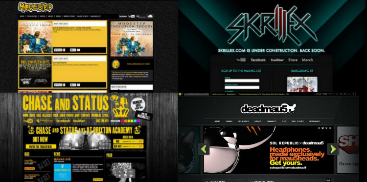
Screen shots of all for of the websites.
|
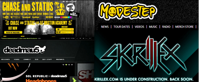
Samples of the text used on the website home-pages.
|
TextThe titles (the artist's name) are made to stand out on each of the pages. Three of them are in the same font as is on their Album covers.
The font used throughout the rest of the page is generally in a more readable font than is used for the artist's name. The colours used for fonts are generally: yellow, white, green. |
