Website Research
Chase & Status Homepage
|
Chase & StatusBackground
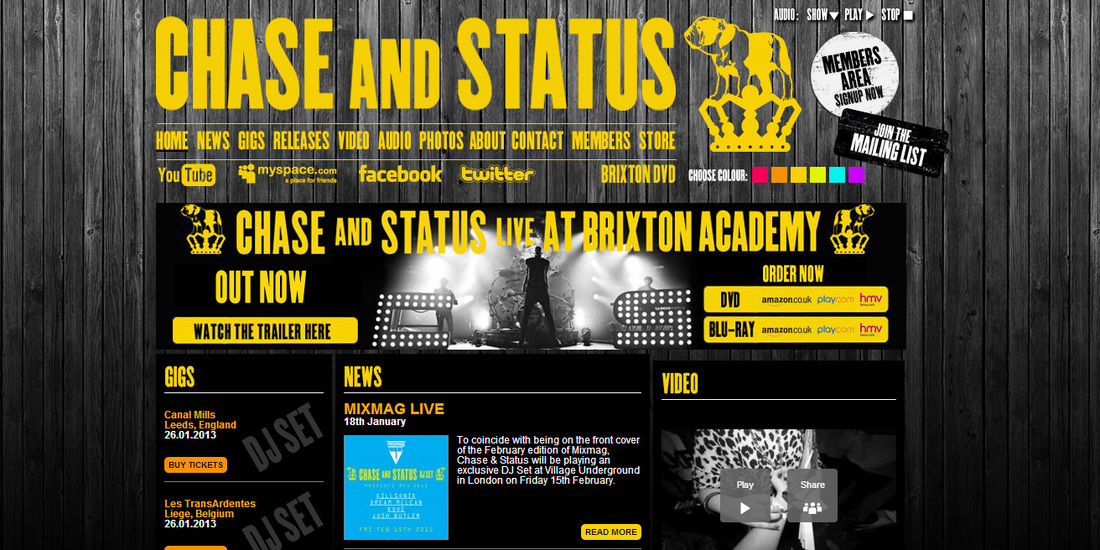
The Background for the whole page is of (presumably) wooden floorboards. This image has been put into grey-scale. The header section of the page simply has this as it's background, but the main part of the page also has a plain background (just black) to make the things on it stand out. Layout The page layout consists of a page header, which includes: Artist's name, artist's logo, page names/links, and social network links. Under this section there is an image/advertisement for a Tour DVD. Under this is the main part of the page, this has been split into three columns. In the left column is a list of all of the upcoming gigs, with buttons that allow you to buy tickets. The middle column has all the news bulletins about the artist. The right column has sections for "videos", "photos" and "store". At the very bottom of the page there is links to all of the main pages again. Text All of the titles on the page are either yellow or orange, the main titles (Artist name, page names, section headers) are also in the same font. The main body text is in a regular font type and is white, and easily readable against the black background. The 'view more' tabs, under the sections, in the right column, are the same font type as the titles, however they are in turquoise, which makes them stand out. |
Deadmau5 Homepage
|
Deadmau5Background
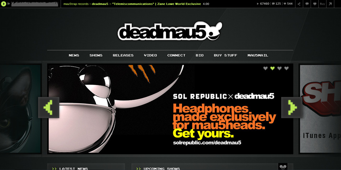
The Background for the whole page is grey (with a small, almost invisible pattern on it). Due to the plainness of the background, the items on the page stand out much more. Layout The page layout consists of the artist's name at the top of the page, with the logo next to it. Under this are the page names/links. There is then an image slideshow, this rotates automatically every few seconds but also has buttons allowing the viewer to do this manually. Most of the images contain the artist's logo and are advertising something. Under this is a jumble of differently sized boxes (6 in total), each of which contains something different - e.g. instagram, news and videos. Under this there is a section which contains comments/tweets from facebook and twitter. At the very bottom of the page there are links to the pages, and to the social networking profiles. Text The artist's name is done in their standard font. It is done in black, with a white outline all the way around. This stands out really well against the grey background, but is still nice and simple. This font is also used for much of the text on the scrolling images. The page names/links have been done in a different font, which is easier to read, these are also in white. The titles in the sections further down have been done in the same font and colour as the page names/links. Sub headings in these sections have been done in a standard font, but coloured bright green. The main body font on the page is also a standard font, but is white. |
Modestep Homepage
|
ModestepBackground
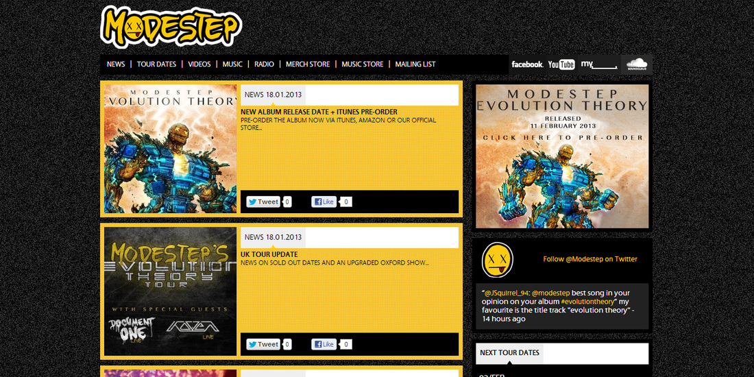
The Background for the whole page is a a small grey and black pattern. However, the sections of the page have plain black, yellow or grey backgrounds, to make sure the items/text on them can be properly taken in. Layout At the top left hand corner of the page, the artist's name and logo is displayed. Under this are the page names/links on the left and on the right are the social networking links. The rest of the page is split into two columns, which each contain several seperate sections. These sections include: Twitter, Tour dates and News. At the bottom of the page are links to the legal information about the page (e.g. cookies). Text The artist's name is done in the artist's usual font. The letters are yellow, outlined n black, and the whole word is then outlined in white. This makes the title stand out from the background. The rest of the fonts on the page are standard fonts in black, white or yellow. |
Skrillex Homepage
|
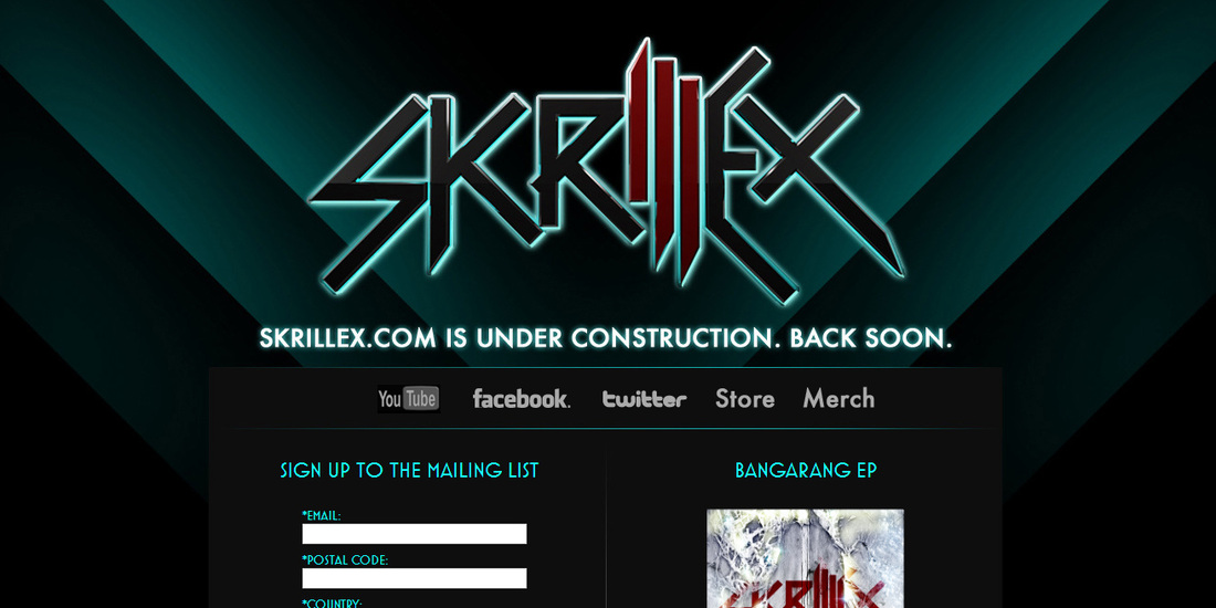
SkrillexThe sight does not always look like this, due to it being under construction currently, however I can get an idea of the layout, font types and colour schemes from the site how it is momentarilly.
Background The background for the page is black, with some dark green lines/lights on it. The main body of the page also has a dark grey background, to make the font/items stand out from the background. Layout The artist's name is placed at the top of the page, underneath this is a message, explaining that the site is currently under construction. Then under this there are links to the social networking pages and to the shop/merchandise for the artist. The next part of the page is split into two columns, on the left side is the option to sign up to the mailing list, and on the right side is an option to view/buy the BANGARANG EP. Under this there is then a selection of CD covers are options to view/buy them. Text The artist's name has been done in the font usually used by the artist. It also contains the artist's logo. Most of the name has been done in black, outlined with green, however the I and two L's that are the logo have been done in red, but are also outlined in green. The message underneath this has been done in white, and outlined by the same green, the font type is a more readable version of the title font. The page links are done in a standard font and are white. The headers for the sections are done in a standard font, but are a bright/dark green. The main body font is the same font type, but white. |
